I often enounter random public art on my daily walk and wonder how it came into existence. I feel like the traveller in Shelley’s Ozymandias, except it’s me who looks on and despairs.
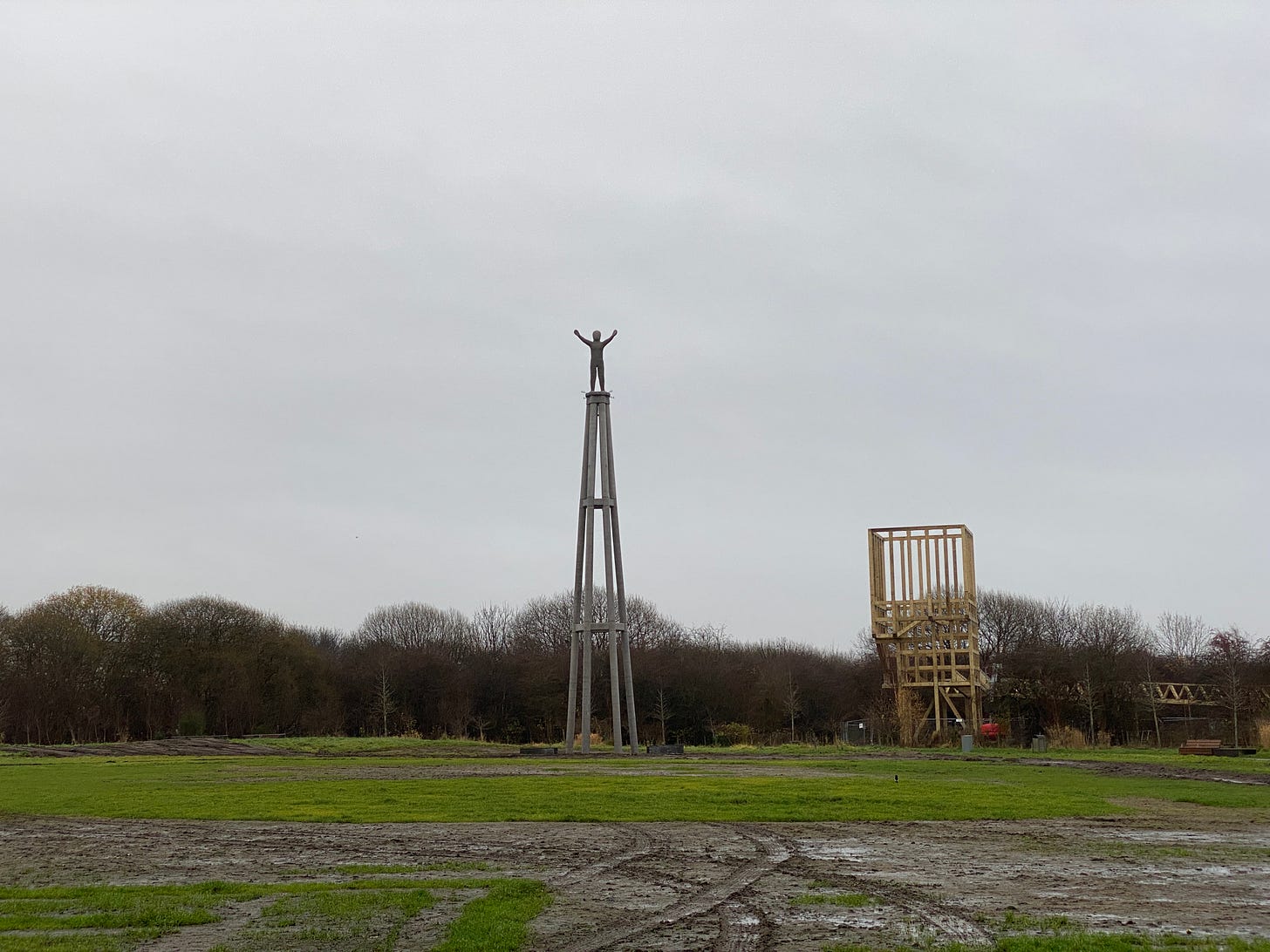
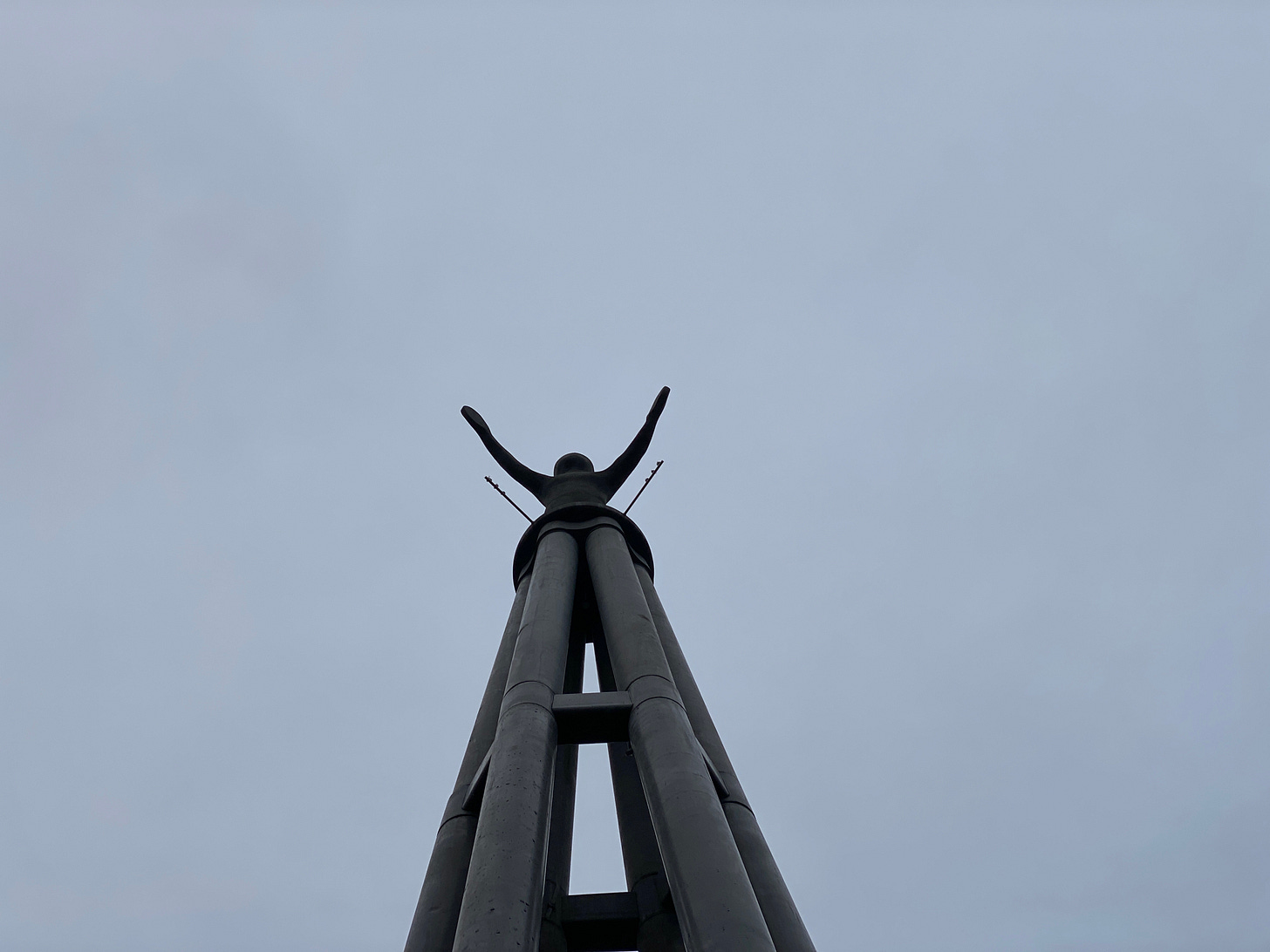
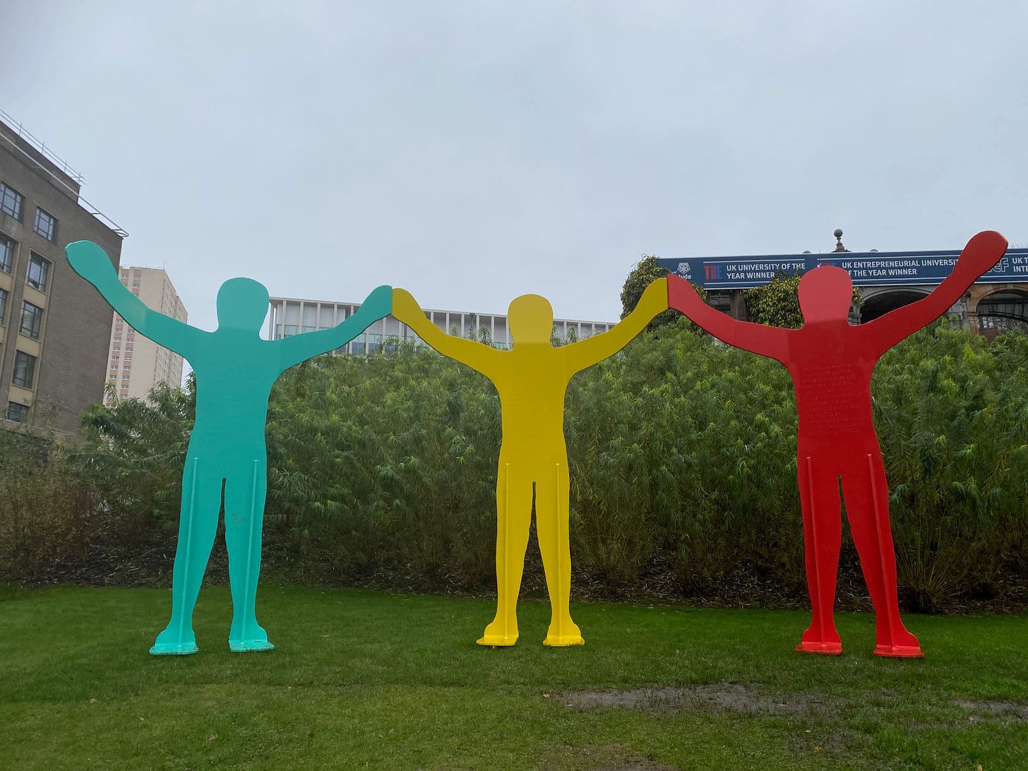
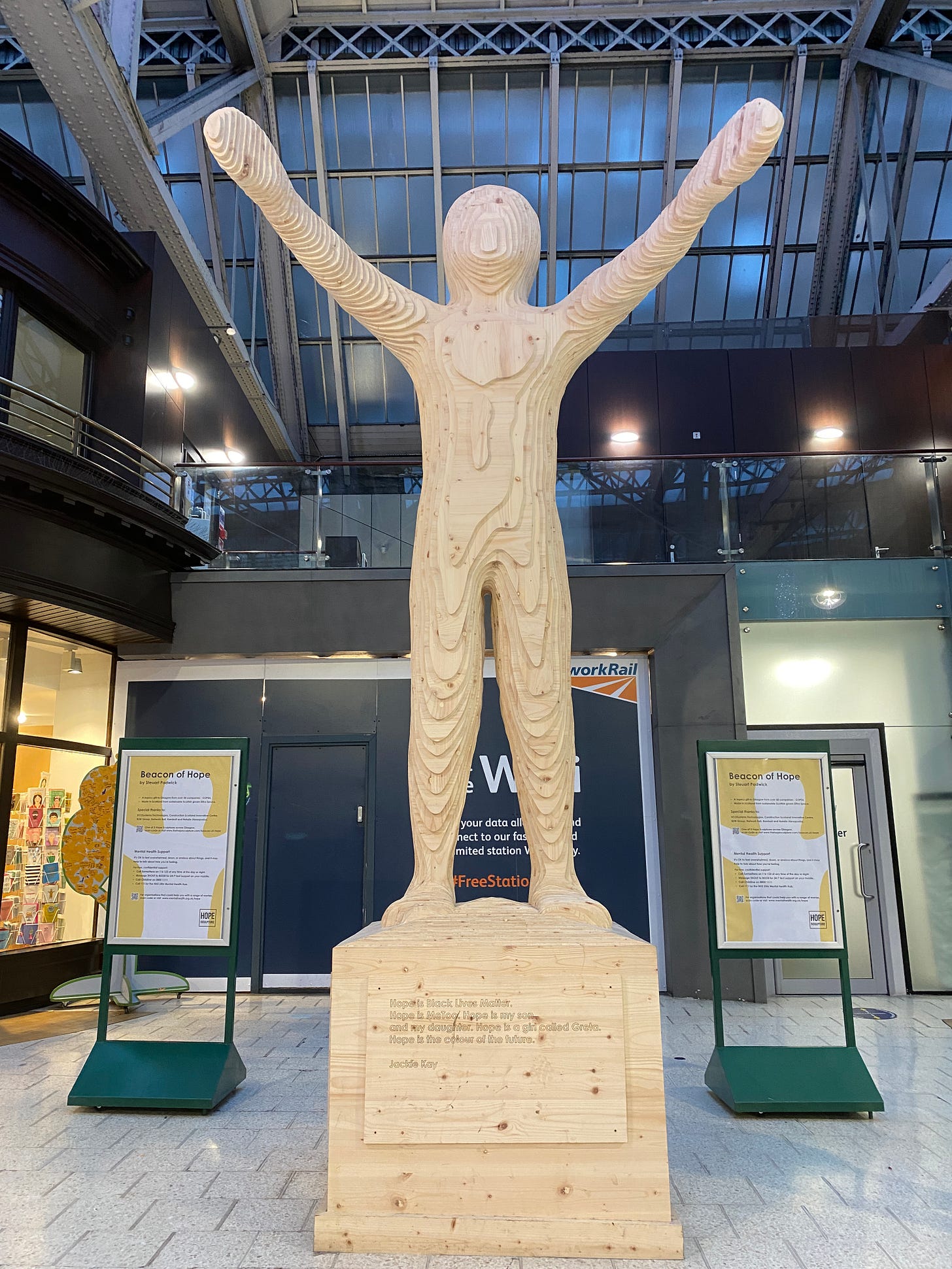
A while back, I walked along the Clyde to Cuningar Loop, a reclaimed piece of industrial land that has been turned into a park. There I found a figure on a 23-metre column—presumably placed so high to rise above the coming floods—which was erected as part of the COP26 legacy. Conceived by Steuart Padwick, who is better known for his furniture designs, it is one of three pieces of public art on the theme of Hope that are situated across the city.
What is the legacy of COP26? In terms of policy, COP26 has been a disaster: Britain briefly lifted the ban on fracking and the war in Ukraine is bringing new fossil fuel exploration. All that talk achieved virtually nothing. Yet, what depressed me more was Padwick’s blobby figures, which are a massive indictment of public art in the 21st century. They certainly don’t evoke hope for the future.
It’s difficult to imagine leaving a legacy when we can foresee our own extinction. Leaving a legacy used to mean building grand architecture, now it’s more important to be carbon-neutral than aesthetically beautiful. Legacy is a footnote in a procurement plan, tacked on by cynical developers.
The genderless blob, sans features or personality, looks like a lost child in a theme park, crying out for its mummy. One is reminded of Simeon Stylites, the Syrian ascetic who spent 37 years living on a pillar in devotion to God. Stylites believed in something. What do these blobs believe?
They might as well be those jelly-baby characters from the Government's healthy eating campaign. This is our universalism: not David, a figure you might aspire towards, but a faceless horror that shows that making something unobjectionable is to make nothing at all.
The values of the age are reflected in our public artworks. In Britain, we can no longer love individual humans with all their complexities and compromises so we abstract humanity until it is unrecognisable. In India, Hindu nationalists create statues of gods or the fathers of the nation. In Asia, statues of the Buddha are permanent reminders of the teaching of impermanence. America, with its lack of history, creates monuments to presidents. Maybe creating monumental things at all is out of step with an ecological perspective and we should be like the aboriginal Australians and create beautiful patterns that are designed to be temporary.
One thing that typifies modern civilization is that everyone is in a rush. When there was a bin strike in Glasgow, the rubbish that piled up in the streets was almost all wrappers from fast food or coffee cups or fizzy drinks cans. Food that can be eaten while walking and drink that fills you were nervous energy. It is hardly surprising that everyone is anxious and exhausted. What we need is a public realm that helps us to slow down and engage with our surroundings. What we need is public art that is rewarding to engage with rather than merely offering a symbolic gesture.
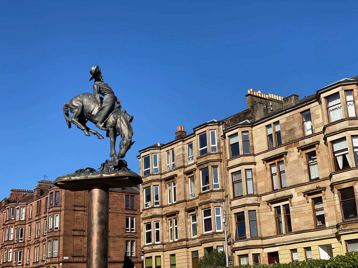
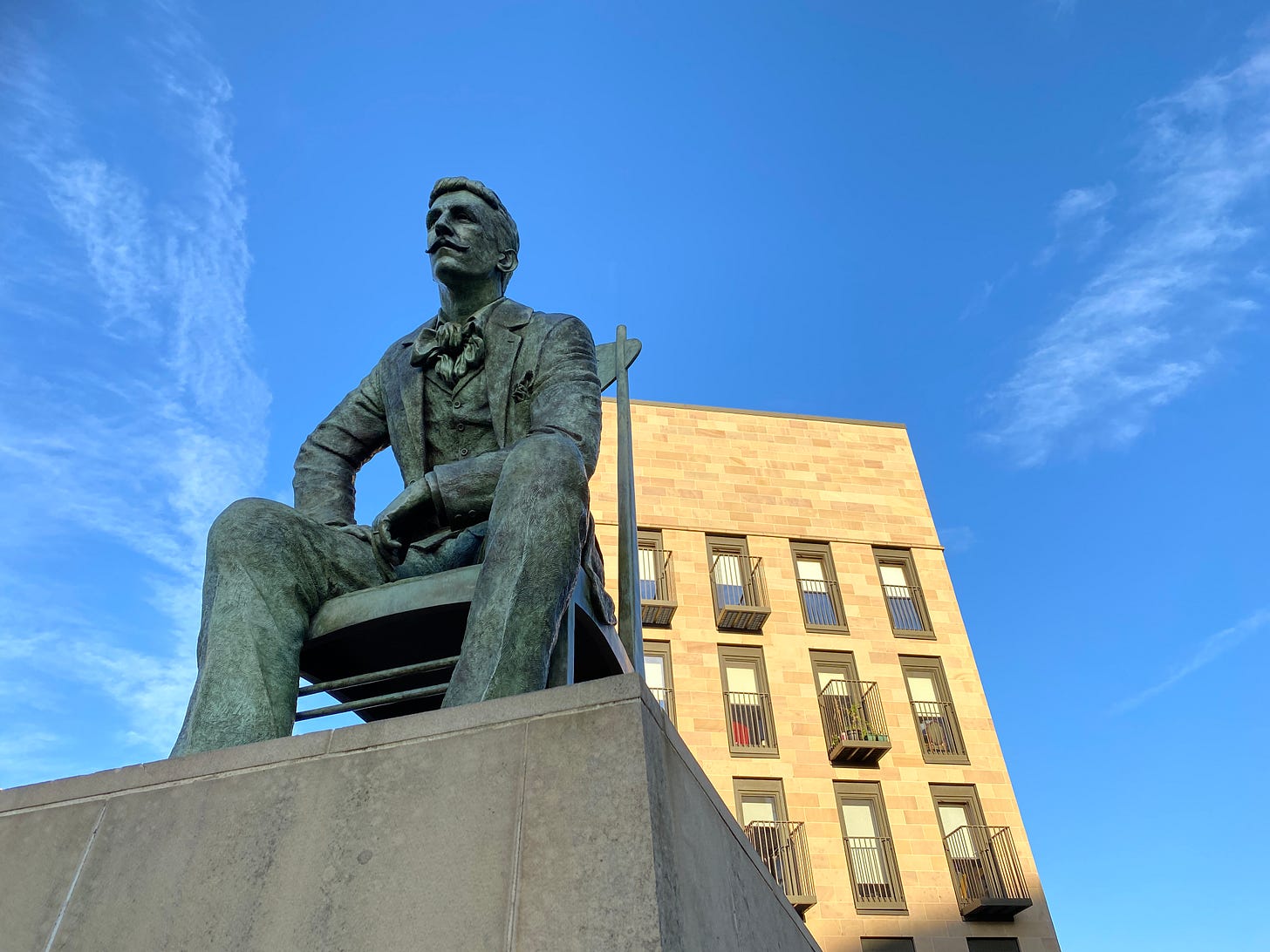
Here are five sculptures that slowed me down on my daily walk:




Don't get me started on public art! First thing I would do is ban ALL public art from the countryside/non-urban areas. But the debate re good v bad public art is as slippery as what we define as good art (specifically contemporary art). The dross masquerading as public art only suffers from the same problem as what is regarded as good (or bad) contemporary art. Arbitrary selection/taste. So, to cite a bad example of contemporary art in a public space, albeit within a building in an urban context I give you Christine Borland's installation in Kelvingrove Museum and Art Gallery. Its not only unfathomable (because its wafer thin in substance) but it LOOKS like tat, too. For me, the selection of this artist (well-regarded by the contemporary art establishment) is no different from the ubiquitous metal figures of Andy Scott which appear, like Gorman's casts of himSelf (sic) all over the place. Different art crowd/demographic for sure but equally tat.
And that Central Station monolith is a horror!