7 Thoughts on UX Scotland 2023
On professionalisation, LinkedIn, design processes, sharing, complexity, fundamentals, and ethics in user experience
I have a bad habit of leaving plates on the kitchen worktop rather than putting them in the dishwasher. Whenever I do this I get chastised by my wife, but the reverse is not the case. That is, if I put them straight in the dishwasher I never get praise.
This is very much like user experience (UX). We only notice an experience when it goes wrong. The wifi cuts out. The website crashes. The button that is impossible to click. The annoying password requirements. The low contrast text. The superfluous animations. The irritating marketing text. If a UX designer has done their job, you won’t know they’ve been there. Every interaction is appropriate to the task you're trying to achieve and therefore invisible.1
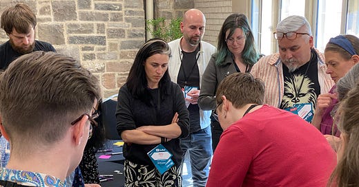
I recently attended UX Scotland, an annual conference for user experience professionals. I was there because, along with one of my UX Glasgow co-organisers, Kat Husbands, I ran a session on communities of practice. Here are some of the things I thought about while I was there.
1. UX is a profession, not a religion
In the early days of UX, there was an evangelical zeal to spread the human-centred message. We thought that if only we could get everyone to empathise with the user then we could solve all society's problems.
The discipline has evolved enormously since Bobby and I started the UX Glasgow meetup. A decade ago there were far fewer user experience jobs. The people who showed up were curious developers and designers who wanted to learn about ‘the new thing’.
Nowadays, UX best practices are embedded in government and the private sector. The early amateur passion has turned into professionalism. Part of the purpose of a conference like UX Scotland is to keep up morale.
A community of practice is where people come together to share knowledge and experience outside of their project teams. In her opening keynote, Kara Kane spoke about being the person who helps build communities of practice for the civil service. In a sprawling bureaucracy, there is a need to reinforce best practices to achieve group cohesion.
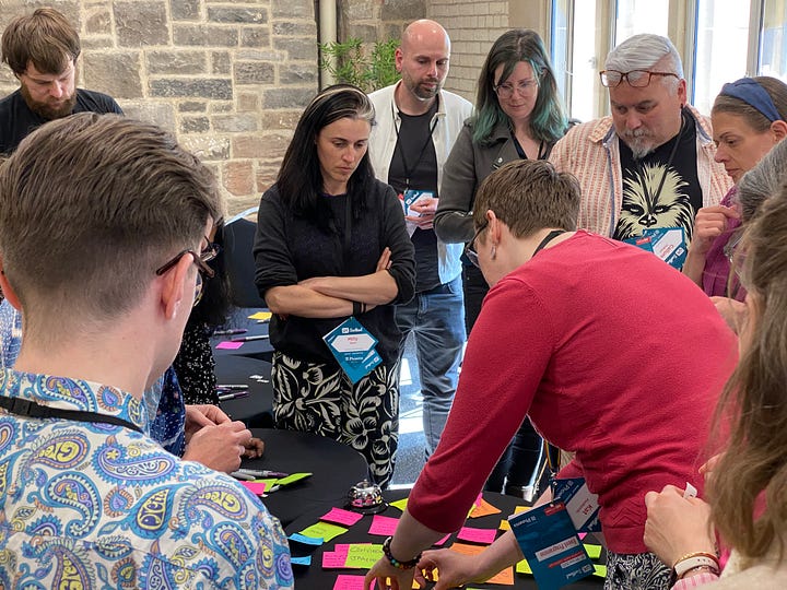
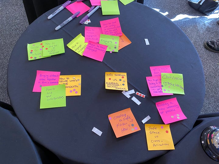
When Kat and I ran a lean coffee on communities of practice much of the discussion was around how to keep people engaged in such groups. Kane's advice was to build knowledge sharing into the job rather than expect people to do it outside office hours.
2. UX professionals love LinkedIn
A few years ago I deleted my LinkedIn profile. I had read Reid Hoffman's book The Start-Up of You and was uncomfortable with a future where everyone is identified with their business role. Look at the ludicrous jargon this guy uses in his conversations with his wife:
I made a digital card to network at the conference but all anyone cared about was LinkedIn. I have rejoined so I can at least take part in the conversation but I am sceptical.
3. Process vs person
In his talk on user needs, Ryan Haney referred to a lot of different processes.2 It reminded me that for every attempt to spread the UX message, there is an equal attempt to turn it into a formal discipline with repeatable methods.
I wondered who would produce better results: a mediocre person with an amazing process or an amazing person with a mediocre process? How much can a good process solve?
Haney spoke of the importance of anchoring these design processes to what the user actually needs. By articulating these needs in a clear way, we can rise above distractions like policy changes and marketing strategies.
4. Share your learnings
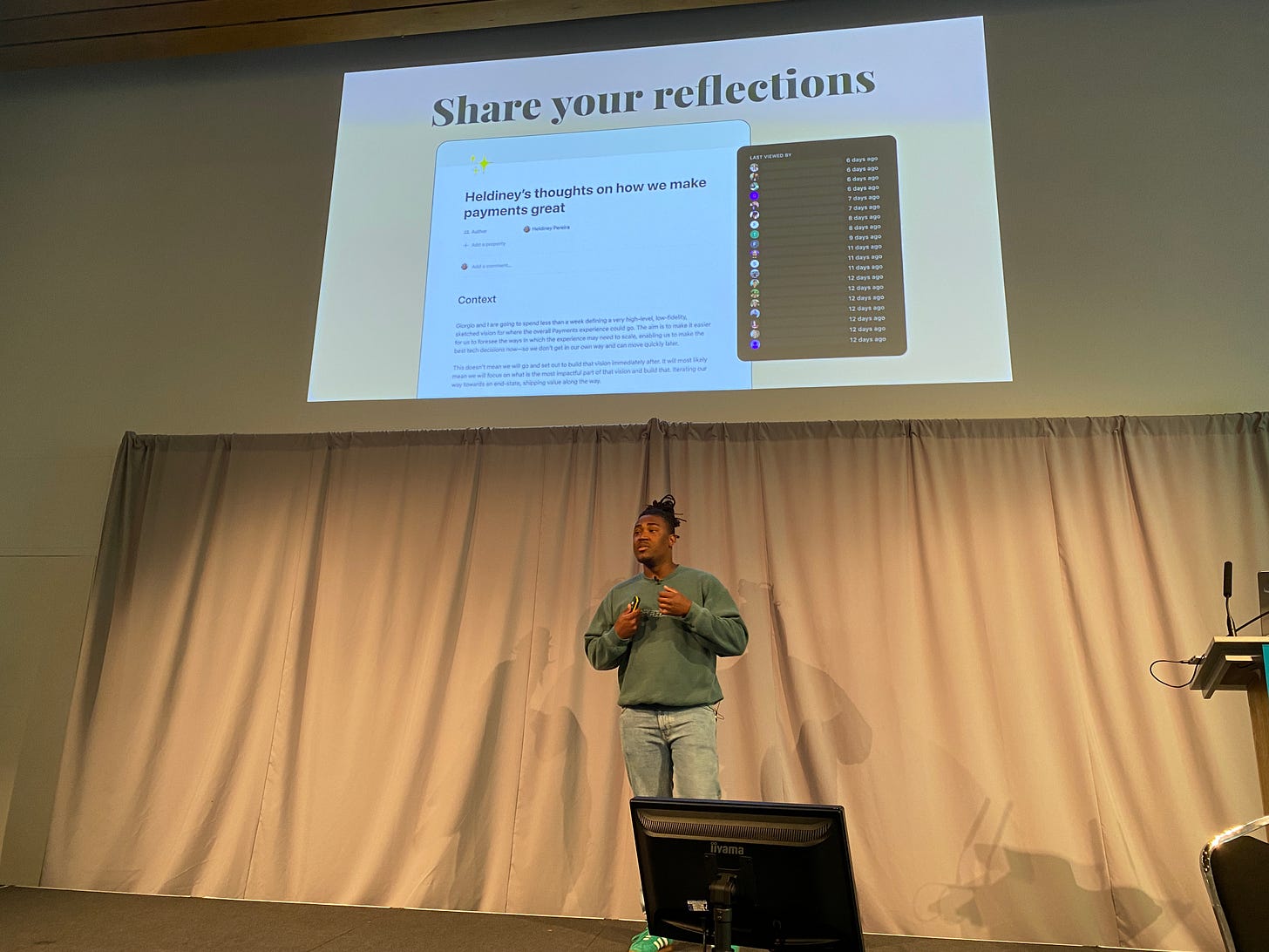
I wish everyone had a blog, not just so that I can learn from them but because I find it helpful to get things out of my head. Heldiney Pereira from Monzo and The Samaritans talked about how bringing his whole self to work and writing about his process has helped bring his team together (as well as improving his mental health). Design outputs are important, but it is only through articulating our process that we can learn from each other.
5. The complexity mindset
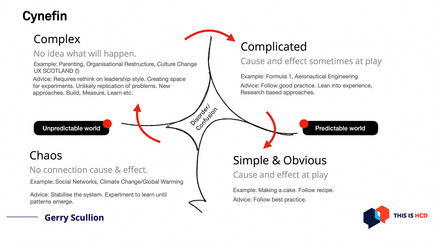
Gerry Scullion hosts a popular podcast on Human-centred Design and has spoken to a lot of smart people. During a break, he told me that doing the podcast was like doing a degree. I can only imagine how much time it takes to research each guest. As a result, his talk was dense with knowledge.
Scullion talked about the murmuration of starlings, communication between ants, and other complex phenomena that rely on low-level feedback rather than top-down decision-making. Whereas the complicated can be broken down into bite-sized chunks, the complex has to be understood as a system.
He recommended tools, like Cynefin, that help map the level of complexity in a decision-making process.
6. Back to basics
I had two main motivations for attending UX Scotland. The first was to discover what's new and the second was to get a reminder on best practices.
Chris How, from Clearleft, refreshed my memory of all the information architecture (IA) projects I've been a part of. There was nothing new, but I enjoyed it nonetheless. Our desire for novelty should not obscure the fundamentals!
The canonical system for arranging information was articulated by Richard Saul Wurman back in the 1980s. The LATCH acronym refers to Location, Alphabetical, Time, Category, and Hierarchy. Chris How showed how tricky it is to find hard edges in IA, making it both an art and a science.
7. UX Ethics: are you a consequentialist or a deontologist?
Each of the previous six thoughts refers back to a talk I attended. This final section brings together everything else I saw under one heading: ethics.
Kat Zhou's keynote on Friday morning was on what it means to do ethical, non-harmful design. She referred to her website, Design Ethically, where I found a neat introduction to the two main philosophical schools of ethical thought.
Consequentialism, which is judging whether something is good or bad by its outcome.
Deontology, which is where an action is good or bad if it is good or bad in principle.
When I saw this, I realised it explains the contradictions in the UX design world. Ian Bogost has pointed out that despite UX practices becoming ubiquitous, the quality of our experiences is not necessarily improving.
For Bogost, UX is the servant of neoliberalism. Businesses became obsessed with metrics, like time spent on a site, and designers gamified and nudged our experience until we were all addicted to smartphones and social networks.
Metrics and analytics reinforce a consequentialist mindset. Even user research and user testing can focus on outcomes like task completion rates.
Stephen Denning and Lynsey Brownlow (in separate talks) looked at the kind of measurements that help us tell stories. They emphasised that metrics have to be tied to good values otherwise short-term boosts in metrics can cause long-term harm to a business. But how can we establish values?
Jason Bootle spoke about his time at a private health startup and how they had an inspiring message that helped motivate the team. This mission statement was their "north star" and helped reassure the team that they were going in the right direction.
A recurring theme at the conference was the attendees' sense that their organisations lacked purpose. They wanted fundamental principles—the deontological—to assess outcomes. I spoke to a few attendees who worked for a big bank and they couldn't imagine having a positive vision for the company. The relentless focus on metrics had left them burnt out and jaded.
The conference ended with a great presentation on accessibility by my fellow UX Glasgow organizer, Stéphanie Krus. Accessibility is an example of a deontological duty that delivers great consequentialist outcomes: empowering people to use your site.
If you want to see Stéphanie (and others) speak, come along to UX Glasgow this Wednesday, 5th of July.
Occasionally you’ll see websites that try to focus on delight rather than functionality. It rarely works out well. As Don Norman says: “if you think something is clever and sophisticated beware-it is probably self-indulgence.”
His LinkedIn profile has an exhaustive list of tools:
Behaviour design, systems thinking, Lean startup, Agile, Kanban, Lean UX, OKRs, impact maps, Product roadmapping, prioritisation, experiment backlogs, opportunity solution trees, development backlogs, user stories, design-driven innovation, design thinking, visual management, design leadership, assumptions, hypothesis testing, journey mapping, service blueprints, experience mapping, mapping services, user needs, citizen engagement, accessibility, usability testing, paper prototyping, prototyping experiences, prototyping mobile, prototyping service, Gov.UK prototype kit, value proposition testing, design strategy.


