Paul Outerbridge
Ready-made for action
It's coming up to degree show season, a time when thousands of fine art students will be trying to justify the last four years of study. What mark will I get? Will a gallery pluck me from obscurity? Should I do commercial work? Can my parents feel proud? These are the questions that might preoccupy them as they plan their exhibition.
Talking with photography students at a recent preview, I didn't get the sense that they'd been emboldened by their time at university. Quite the opposite. They seemed uncertain in their aesthetic, nervous about the job market, and anxious about the state of the world.
More than one student spoke guiltily about the effects of the chemicals used in the photographic process. It was as if they had inherited a house filled with asbestos and were already weary at the prospect of renovation.
A century ago things were very different. Paul Outerbridge (1896-1958) was a student at Columbia University for barely a year before he was commissioned by Vanity Fair and Vogue. Then, in 1925, he was invited to London for a one-man show. From there he travelled to Paris, as Surrealism flourished, becoming pals with Marcel Duchamp, Berenice Abbott, and Man Ray.1 His early career could not have gone better.
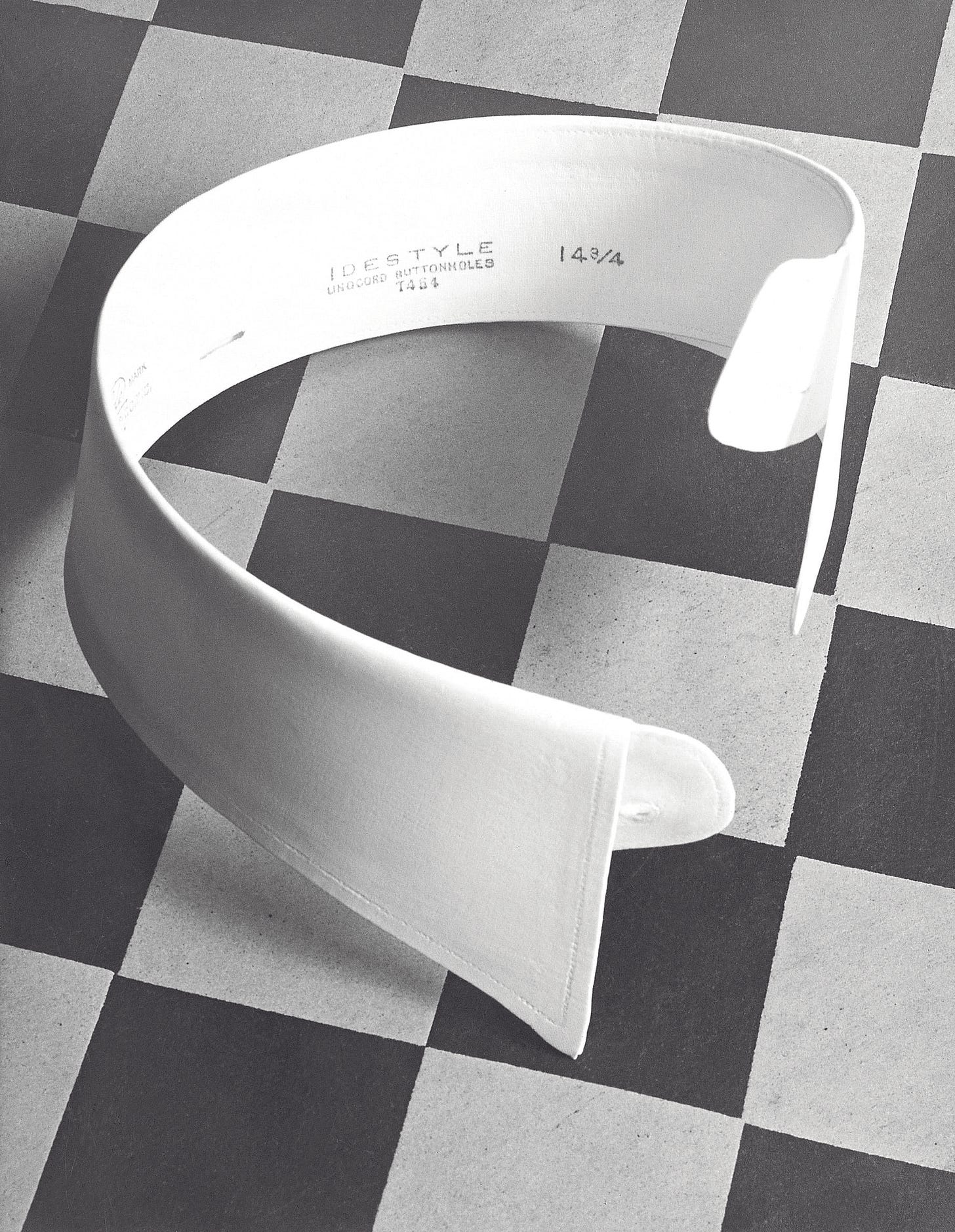
On returning to New York in 1929, Outerbridge became a master of early colour photography—long before the pioneering work of William Eggleston, Saul Leiter, and Helen Levitt. The technique he employed was incredibly time-consuming and expensive. Each tri-color carbro shot cost $150 (equivalent to $3,500 in today’s money) and took around nine hours to produce a print.
Unlike many artists, for whom working in advertising is selling out, there is no condescension in Outerbridge’s commercial work. It remains resolutely modernist in spirit.

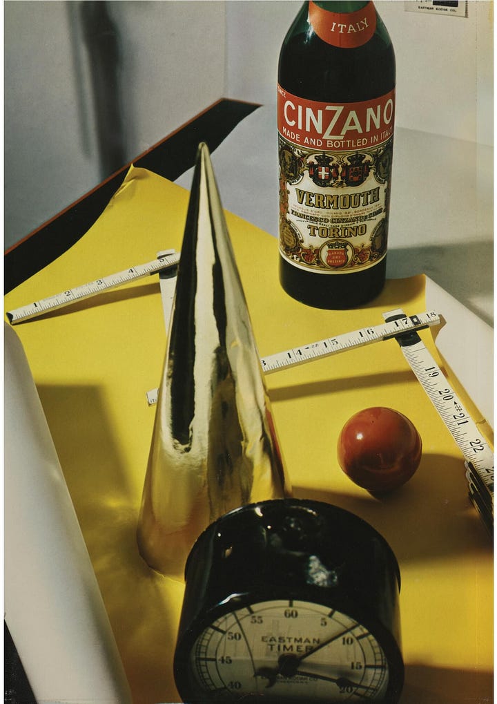
A few years later, however, the enormous technical challenges involved in early colour photography became trivial using Kodachrome. Instantly, the value of his skills plummeted. Most viewers don’t care about technique, all that matters is whether the photographs are compelling.
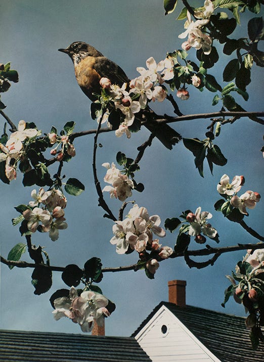
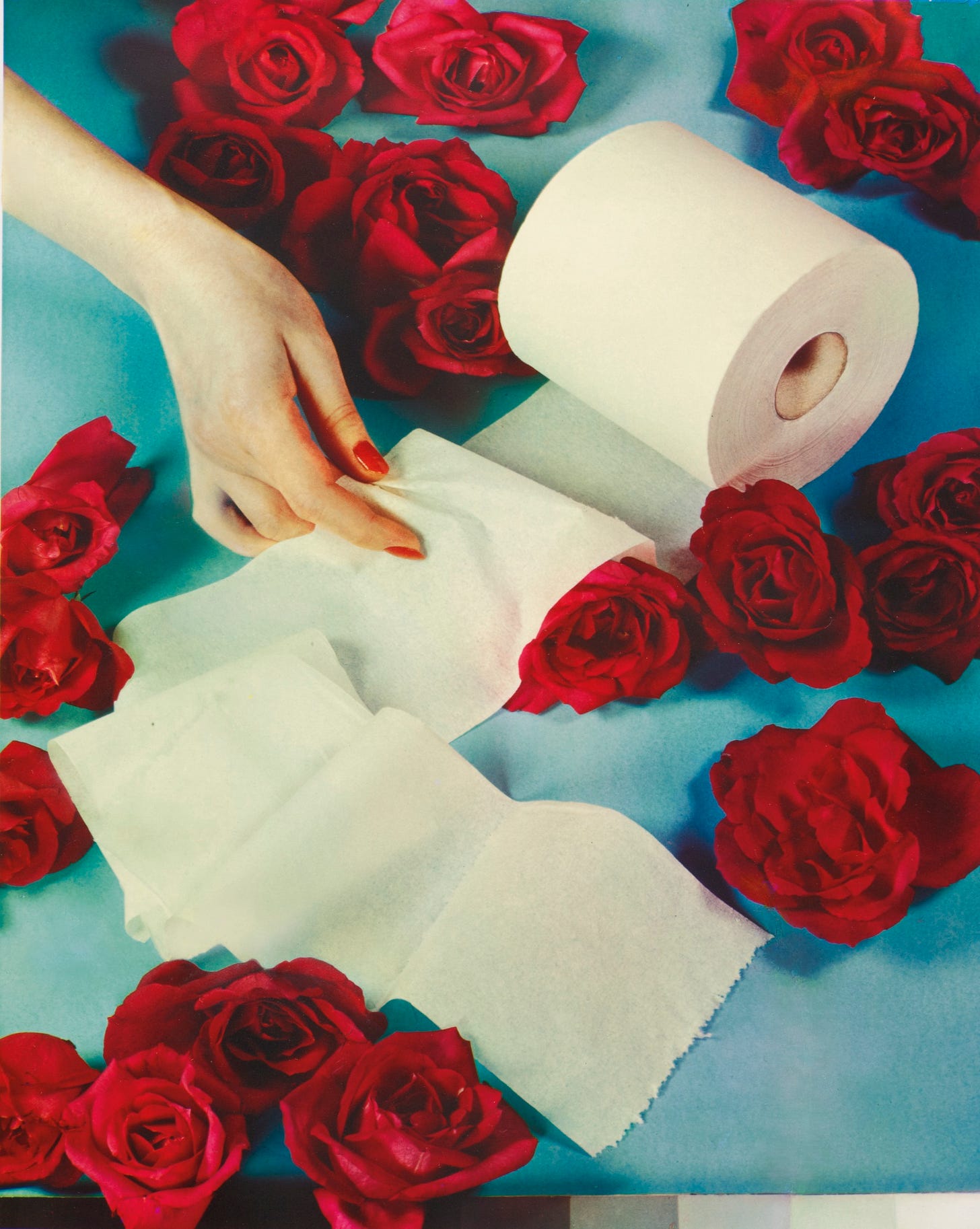
I think they are compelling. As Ken Johnson points out, there’s a scene in David Lynch’s Blue Velvet that is almost a direct copy of Outerbridge’s photograph. The artificiality of his colours is eerie rather than alienating. Not everyone agrees; Donald Kuspit writes that “Outerbridge’s spiffy, reified colors are emotionally dead on arrival.”
In 1943, Outerbridge moved out to California in the hope of making a career in Hollywood, but he never got a break and ended up running a small portrait studio in Laguna Beach. While his rival Edward Steichen received plaudits, Outerbridge faded into obscurity. For all his modernist experimentation and commercial success, Outerbridge's style had fallen out of fashion.
I love the image of him at a local art fair in 1951, looking like a Sunday painter. He is proud of his work and grateful for the opportunity to show it off. I hope the students get to feel something similar at their degree shows.
Thanks for reading The Crop. Check out my weekly photojournal:
The photographs in this article are used for criticism and review under the Fair Dealing provision of UK Copyright Law. All rights to the image remain with the photographer/copyright holder. This use does not claim any rights to the original work and is not for commercial purposes.
Check out Xavi Buendia’s article on modernist photography for an overview of the period.




Every generation faces challenges!
A good read 👍
Thanks Neil for the insights. Heard of him, but now can appreciate Outerbridge more. Love the advertising work!